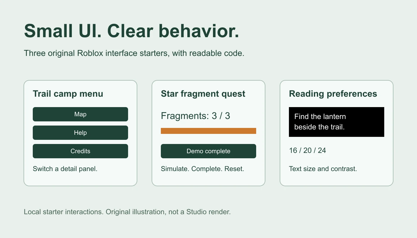
These Roblox UI templates are three original, free LocalScript starters: a menu with three text panels, a quest tracker with simulated progress, and reading preferences for sample text. Try their browser previews above, then download the readable Lua files and paste one into a spare Studio place. No image pack, plugin, external module or account is required to download them.
Choose a UI template and download its code
| Template | Included behavior | Download |
|---|---|---|
| Menu | Map, Help and Credits buttons switch the detail text. | menu.lua |
| Quest tracker | Simulate up to three fragments, show progress and reset. | quest-tracker.lua |
| Reading preferences | Choose sample text size, toggle sample contrast and reset. | reading-preferences.lua |
These are code-generated ScreenGui starters, not .rbxm models, .rbxl places, Figma files or static PNGs. The source creates the interface when the LocalScript runs. Downloading a Lua file alone does not install it into your place.
The templates deliberately separate visible UI state from real game systems. The menu does not teleport players, the quest demo awards nothing, and preferences affect only the sample text during the session. That makes each starting behavior easy to inspect before connecting it to your game.
Install one template in Roblox Studio
- Save a spare practice place or a copy of your project.
- Open the downloaded .lua file in a text editor and read it. It uses built-in Roblox UI objects and does not load remote code.
- In Explorer, expand StarterPlayer → StarterPlayerScripts.
- Insert a LocalScript with a clear name such as PracticeMenuTemplate. Keep the default camera and control scripts.
- Replace the LocalScript contents with the entire downloaded file.
- Start a player playtest. The script waits for that player's PlayerGui and creates its own uniquely named ScreenGui there.
- Use each button, inspect Output, then stop the test before editing the starter.
The StarterPlayerScripts reference describes how its LocalScripts are copied to a player's PlayerScripts on join. These downloads use that route to construct the UI. They do not ask you to put a prebuilt ScreenGui in StarterGui.
The code has been syntax-checked and its event/state behavior has been exercised with mocked objects. It has not been rendered or operated inside Roblox Studio for this guide. The browser preview is a separate implementation, so confirm the actual layout, scrolling and input behavior in your place.
Menu template: make each button explain one destination
The menu begins with the Map detail. Help and Credits replace that text with their own descriptions. To customize it, find the routes table near the bottom of menu.lua. Change each route's text and detail before adding more destinations.
Keep button labels tied to what actually happens. If a button only opens instructions, call it Help. A label such as Play or Join should wait until you implement and test the corresponding game flow. Switching a text panel does not start matchmaking or a round.
The button event uses GuiButton.Activated, Roblox's event for mouse, touch and gamepad activation. Test selection and focus on the devices you support; an event binding alone does not establish a usable controller navigation path.
Quest tracker template: keep the progress demo local
Use Simulate one fragment to advance from 0 / 3 to 3 / 3. The fill grows with the count, the completion state prevents progress beyond three, and Reset progress restores the initial state. This is a UI exercise: it does not find fragments in the world.
For a real collection quest, replace the simulation button with progress received from your game's validated quest state. The server should decide whether a collectible was earned and whether a reward is due. Then the client can display that result. Do not trust a client label or a local counter as proof of completion.
Start by testing one real collection event and one reset condition. Decide whether progress survives death, leaving or a new round before adding saving. For client requests and server checks, use the RemoteEvents guide. For owned-item rules, see the separate inventory system example.
Reading preferences template: change a clearly scoped sample
The reading starter offers text sizes 16, 20 and 24. High contrast changes the sample to white text on black. Reset preferences restores size 16 and the original sample colors. These controls do not modify every interface in the game or the player's Roblox account settings.
When adapting the pattern, define which labels inherit the preference and retest their wrapping. A longer instruction may need more height at the larger size. If you later save a preference, make that a separate feature with loading, defaults and failure behavior; no save system is included here.
Understand the generated hierarchy
Each script makes one ScreenGui, one scrolling panel, a size constraint, padding, a vertical layout and its labels and buttons. The names are ObbyTemplateMenu, ObbyTemplateQuest and ObbyTemplateReading. A duplicate-name guard warns and stops instead of stacking another copy of the same starter.
Roblox's ScreenGui reference explains that the container displays on a player's screen from PlayerGui. ResetOnSpawn is set to false in these examples; test respawn in the actual game and define whether your interaction state should reset separately.
The panel uses relative sizing with outer margins and a maximum of 460 by 460 pixels. UISizeConstraint limits that size. ScrollingFrame.AutomaticCanvasSize is set to Y, and labels can grow vertically. This is intended to keep longer content reachable rather than forcing every screen to fit one fixed rectangle.
Customize colors, corners and spacing
Begin with the shared helper functions near the top of the downloaded script. The label helper controls text color and size; the button helper controls button colors and its corner radius. The panel owns outer padding, while UIListLayout controls the gap between children. Change one group at a time and compare the result.
The original palette uses forest-green text and buttons, a pale panel, and an amber progress fill. Replace it with your game's colors after checking foreground/background contrast. Keep the distinction between color changes and behavior changes clear in your test notes.
For corner sizing, use the UICorner guide. If you want to build the hierarchy manually before editing generated code, start with the Roblox GUI tutorial.
Test the starter before connecting it to a game
- Test one template at a time; the three centered panels will overlap if you enable all of them together.
- Use every button and compare the expected state with the visible result.
- Try a narrow portrait view and a short landscape view. Scroll to the final control and inspect wrapped text.
- Check the top bar and device cutouts. The scripts leave the ScreenGui inset defaults in place; Roblox recommends CoreUISafeInsets for interactive UI.
- Test mouse, touch and gamepad activation and selection where applicable.
- Respawn and confirm the intended UI and state behavior.
- Run a two-player test before connecting real quests, purchases or shared game state.
The on-screen containers guide explains the safe-area and display-order controls. If another interface covers the starter, inspect Enabled and DisplayOrder along with your existing UI owners instead of hiding Roblox's core controls to make space.
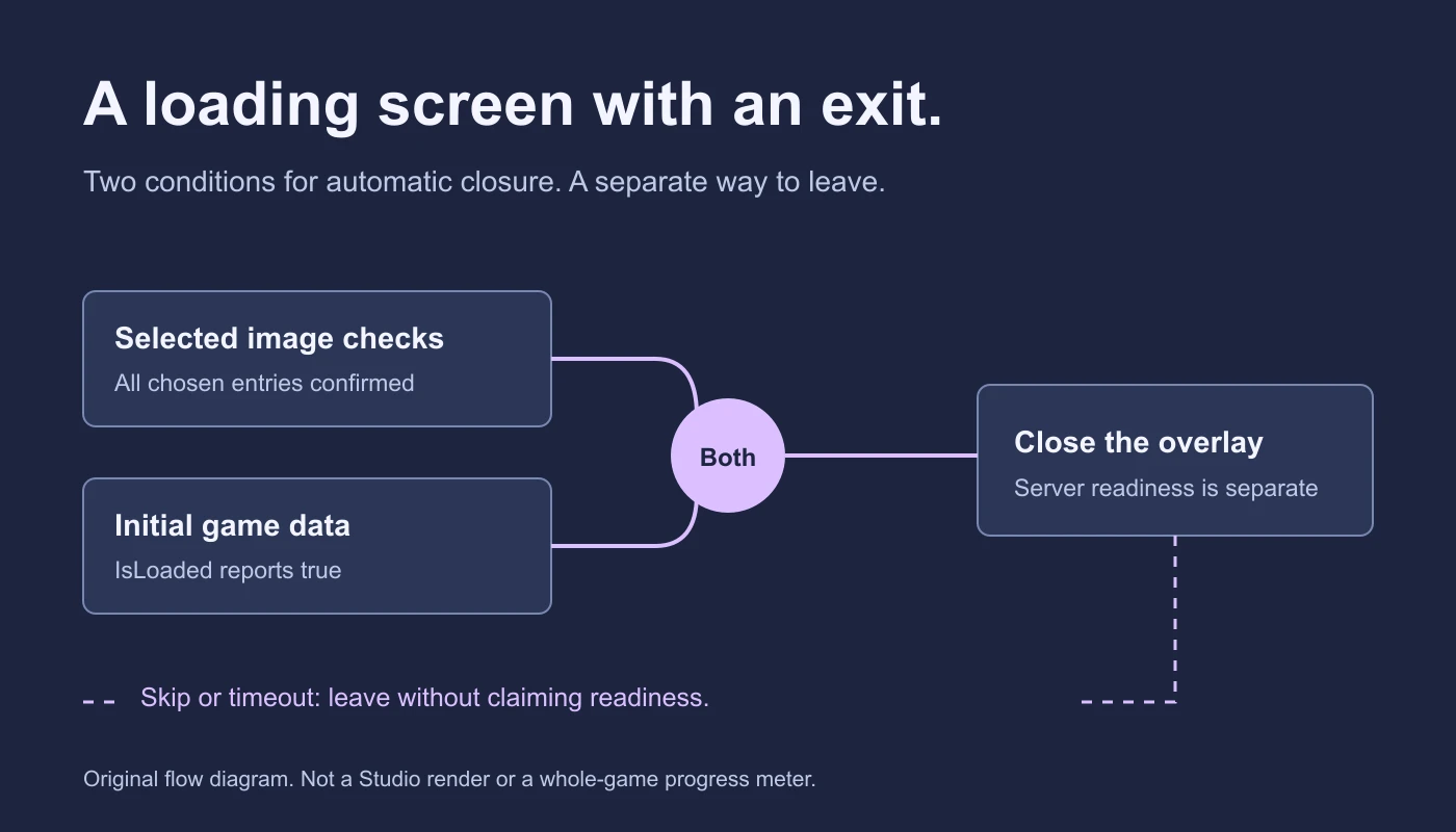
For an initial-join overlay with selected-image checks and an exit policy, use the loading-screen starter.
What these templates do not include
This starter pack contains no inventory ownership, checkout, teleport, reward, persistence or audio system. The three UI interactions are intentionally complete as local demonstrations; a production feature needs its actual game rules connected and tested. For a Coins shop with server-owned purchases, use the shop tutorial rather than treating a template button as a purchase system.
To continue in an Obby project, describe which starter you want, the action each control should perform, and the state the server must own. Review the generated code and test the finished player flow in Studio. Documentation reviewed November 21, 2026.