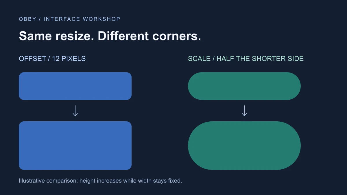
To make a rounded GUI in Roblox, add a UICorner under the Frame or button you want to round, then set its CornerRadius. Use an offset for a pixel-based radius or scale for a radius based on the parent’s shorter dimension.
Round one object first
- Create a ScreenGui in StarterGui and add a Frame inside it.
- Give the Frame a visible background and a useful size.
- Add a UICorner directly under that Frame.
- Set CornerRadius to a small offset, such as 12 pixels.
- Preview the interface and resize the Frame before applying the style elsewhere.
The component affects its parent. If you put it under the wrong object, inspect that parent before adding more components. Start with one plain card so an image, border, or nested panel does not hide what you are testing.
Compare offset and scale with a complete example
Place this LocalScript in StarterPlayer → StarterPlayerScripts and start Play. It creates two labeled cards in a new ScreenGui. After four seconds, both become taller. The example is documentation-reviewed but has not been executed in Studio for this guide.
-- LocalScript in StarterPlayer > StarterPlayerScripts.
-- Documentation-reviewed exercise; not Studio-executed.
local Players = game:GetService("Players")
local gui = Instance.new("ScreenGui")
gui.Name = "CornerPractice"
gui.ResetOnSpawn = false
gui.Parent = Players.LocalPlayer:WaitForChild("PlayerGui")

local function card(name, y, radius)
    local frame = Instance.new("Frame")
    frame.Name = name
    frame.Size = UDim2.fromOffset(260, 64)
    frame.Position = UDim2.fromOffset(24, y)
    frame.BackgroundColor3 = Color3.fromRGB(45, 90, 170)
    frame.BorderSizePixel = 0
    frame.Parent = gui
    local corner = Instance.new("UICorner")
    corner.CornerRadius = radius
    corner.Parent = frame
    local label = Instance.new("TextLabel")
    label.Size = UDim2.fromScale(1, 1)
    label.BackgroundTransparency = 1
    label.Text = name
    label.TextColor3 = Color3.new(1, 1, 1)
    label.TextSize = 18
    label.Parent = frame
    return frame
end

local fixed = card("12 pixel radius", 32, UDim.new(0, 12))
local proportional = card("Half of shorter side", 120, UDim.new(0.5, 0))
task.wait(4)
fixed.Size = UDim2.fromOffset(260, 112)
proportional.Size = UDim2.fromOffset(260, 112)
print("Compare the corners after increasing both heights")
Read the resize comparison
| Card | 260 × 64 | 260 × 112 |
|---|---|---|
| Offset 12 | 12 pixels | 12 pixels |
| Scale 0.5 | 32 pixels | 56 pixels |
The UICorner reference explains that scale uses the smaller of the parent’s width and height, with circular corners capped at half that dimension. That makes 0.5 scale a useful pill choice for a wide rectangle.
These values describe the intended geometry of the example, not measured screenshots. Notice the difference after resizing: the fixed-radius card keeps a similar corner treatment, while the proportional card grows its end curves. Neither is automatically the better style; choose based on the intended component.
Choose a radius for the component
For a family of rectangular settings panels, start with a consistent offset and compare the smallest and largest panel. For a capsule-style action button, compare a proportional radius at several widths and heights. Keep text away from the curved ends instead of filling every available pixel.
Use one label with a short word and another with a longer phrase during your design pass. If the longer phrase crowds the ends, adjust the content layout rather than assuming the corner radius will create padding for you. The transparent labels in the example avoid covering the parent’s rounded background.
Check descendants and scrolling separately
A rounded parent does not automatically clip its descendants to the corner shape. Inspect child backgrounds and images near the edges. UICorner is also not directly supported on ScrollingFrame; use an appropriate surrounding layout and verify the scrolling content separately.
For a card with an image, first confirm the card’s own background is rounded, then inspect the image’s shape. A square child can make a rounded parent look broken even when the parent’s component is working.
Know which corner controls your Studio version supports
Current documentation lists individual corner-radius properties under the New UI Capabilities beta. This example uses CornerRadius to set every corner together. If you later use individual radii, remember that assigning CornerRadius again overwrites all four.
Keep the first test simple before combining style rules with per-corner settings. Record which component owns the radius so a later style change does not silently overwrite your intended shape.
Troubleshoot the result
- Still square: confirm the UICorner is a child of the visible GuiObject and its radius is not zero.
- Unexpected pill: compare the calculated radius with half the shorter dimension.
- Square image over a rounded card: inspect the child image separately.
- Text crowds the ends: provide content spacing and test a longer label.
- Only some sizes look right: compare offset and scale using the smallest intended layout.
Continue with the GUI tutorial for the broader interface hierarchy. Documentation reviewed November 17, 2026.