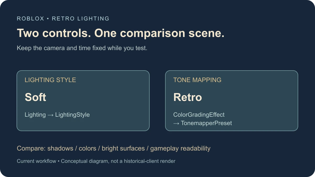
For retro lighting in current Roblox Studio, start with LightingStyle set to Soft, then compare a ColorGradingEffect using the Retro TonemapperPreset. Keep a fixed test scene while you tune the result. These are two separate controls: lighting style changes the rendered scene’s lighting, while tone mapping changes how its colors reach the screen.
Use the current controls
Roblox’s global lighting guide describes Soft as the flatter, retro-style option and Realistic as the more naturalistic option. Select Lighting in Explorer and use the LightingStyle dropdown in Properties.
The Technology reference says the older workflow has been superseded by LightingStyle and PrioritizeLightingQuality. If an old video asks you to choose Compatibility, Voxel, or another Technology mode, do not assume the same dropdown is still the right route in your installed Studio.
This guide targets a deliberate retro-inspired appearance with current controls. It does not promise pixel-identical output from a particular past Roblox client.
Build a comparison corner first
Use a copy of a place or a spare scene. Put several simple colored blocks beside a neutral wall, a shaded area, and one local lamp. Choose a camera angle that shows all four. Keep the geometry, camera, and time of day constant for the first comparison.
Record your starting LightingStyle, ClockTime, Brightness, Ambient, OutdoorAmbient, and ExposureCompensation. Also record existing effects under Lighting and the camera. That baseline lets you reverse a change without guessing which combination produced the original scene.
The following procedure is documentation-reviewed and has not been executed in Studio for this guide. Use it as a controlled exercise and compare the actual output in your own place.
Set LightingStyle to Soft
- In Explorer, select Lighting.
- In Properties, find LightingStyle and choose Soft.
- Leave the other recorded settings unchanged for this first pass.
- Compare the same camera view with your baseline, paying attention to shadows, object separation, and the local lamp.
LightingStyle is an edit-time Properties control in the documented workflow. Do not paste an old runtime script that tries to force a deprecated rendering mode. If a setting is missing, confirm the selected object and your installed Studio version before changing unrelated environment properties.
Add the Retro tone mapper as a separate test
Roblox’s post-processing guide describes ColorGradingEffect.TonemapperPreset. Default targets the post-2019 appearance; Retro imitates the earlier appearance with less saturation and contrast.
- Inspect Lighting for an existing ColorGradingEffect before adding another one.
- For a clean spare scene without one, insert a ColorGradingEffect under Lighting and give it a recognizable name such as RetroPracticeGrade.
- Set TonemapperPreset to Retro and keep the effect enabled.
- Compare the same scene with the effect enabled and disabled. Then compare Default and Retro while leaving LightingStyle at Soft.
Keep the effect’s role clear in your notes. Soft is not a tone-mapper preset, and Retro is not the name of a LightingStyle. Changing both at once makes it harder to explain why the image changed.
Use a simple comparison log
| Pass | Change | Record |
|---|---|---|
| Baseline | None | Camera, time, lighting values, active effects |
| Style | LightingStyle → Soft | Shadows, local-light response, object readability |
| Tone map | TonemapperPreset → Retro | Color separation, contrast, bright surfaces |
| Light intensity | Review light brightness | Clipped-looking highlights and lost detail |
| Device check | Test intended quality levels | Which differences affect gameplay visibility |
Save a screenshot from each pass using the same framing. Give the files names that identify the change, not only “better” or “final.” A useful comparison explains which control changed and whether the result helps the scene.
Review brightness without copying a universal recipe
For a pre-2019-inspired look, Roblox’s post-processing guide suggests experimenting with Retro and limiting light brightness to 1.0. Treat that as a starting experiment rather than a substitute for checking your own scene.
Inspect global Lighting.Brightness and local PointLight, SpotLight, or SurfaceLight objects separately. Changing only the sun while a bright local lamp dominates the view will not isolate the problem. Keep a record of every intensity you change.
A neutral wall is useful here: it helps reveal whether a bright area has lost detail. Colored blocks help you judge whether nearby colors remain distinguishable after tone mapping. The best value depends on the scene, sky, materials, and artistic target.
Keep post-processing effects understandable
A strong ColorCorrectionEffect, bloom, or another screen effect can change the appearance of the same lighting setup. Inspect the effects already in your place, including camera-local effects, before adding more.
In a spare copy, compare one effect at a time by toggling its enabled state and restoring it afterward. Do not delete an existing effect just because the first comparison is confusing. It may belong to a gameplay feedback system or another part of the visual design.
Check quality and view distance
The Lighting reference explains that the actual shadow path also depends on PrioritizeLightingQuality. That property trades lighting and shading quality against view distance as rendering quality decreases. Soft is an artistic choice, not proof of a particular shadow implementation or a guaranteed frame-rate gain.
Walk through the actual play area at the quality levels and devices you intend to support. Check a dark doorway, a distant platform, and the local lamp from the comparison corner. A nostalgic screenshot is insufficient if players cannot identify the route or interactable objects.
When the scene still looks wrong
- The old Technology option is missing: use the current style and quality controls rather than reproducing an outdated menu.
- Retro does not appear in LightingStyle: look at ColorGradingEffect.TonemapperPreset instead.
- The change is difficult to see: hold the camera and time fixed, inspect other effects, and compare one control at a time.
- The result is too dark: inspect actual light levels and readable surfaces before compensating with several unrelated filters.
- It differs on another device: record quality settings and test which visual difference affects navigation.
- The scene feels modern despite the filter: inspect geometry, materials, sky, and composition. Tone mapping does not replace the rest of the art direction.
For a more naturalistic visual target, use the separate realistic lighting guide. Keep both workflows tied to the same small comparison scene so the difference is a clear design choice.
For atmospheric haze or missing distance-fog settings, use the fog and Atmosphere guide.
Documentation reviewed November 17, 2026.